
The best interior color combinations create a home that feels balanced, inviting, and naturally harmonious. From warm neutrals and earthy tones to rich contrasts and soft, complementary shades, the right palette can transform the atmosphere of any room.
Creating color harmony isn’t about choosing perfect shades. It’s about understanding how colors work together — balancing warm and cool tones, using contrast thoughtfully, and allowing each color to play its part.
In this guide, discover beautiful color combinations for your home, practical tips for choosing a balanced palette, and simple ways to avoid common decorating mistakes.
How Colors Affect Mood and Space
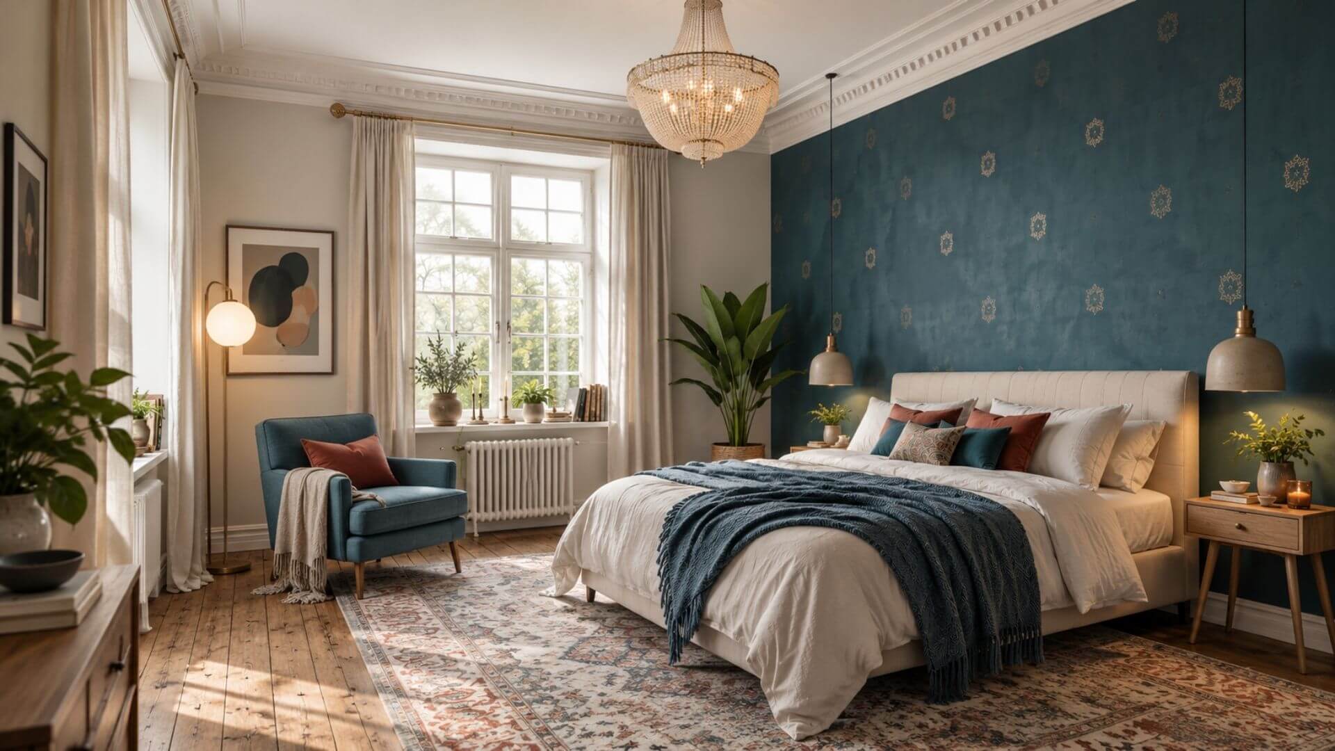
Calming bedroom with soft teal and warm neutral tones
Colors influence more than how a room looks — they also shape its atmosphere. Understanding the relationship between warm, cool, and neutral tones helps you create interior color combinations that feel balanced, welcoming, and harmonious.
🧡 Warm Colors – Energy and Comfort
Red, orange, and yellow bring warmth and visual energy to interiors. They work especially well in living rooms and dining areas, where softer neutrals can balance their intensity. For a subtle touch, use warm colors in cushions, artwork, or decorative accents.
💙 Cool Colors – Calm and Balance
Blue, green, and violet are often associated with calm and relaxation. Muted blues and soft greens are beautiful choices for bedrooms, reading corners, and home offices. Natural wood and warm textiles help keep these palettes inviting.
🤍 Neutral Colors – A Harmonious Foundation
White, beige, gray, and earthy neutrals create a versatile foundation for any room. They soften stronger shades, connect different materials, and allow accent colors to stand out without overwhelming the space.
The secret to color harmony isn’t choosing the perfect color — it’s finding the right balance between colors.
Colors That Work Together – Balance Through Contrast

Some of the most harmonious interior color combinations are created through contrast. Pairing cool and warm tones adds depth and character without making a room feel overwhelming.
In this living room, a deep blue sofa creates a calm, elegant foundation, while a cognac-brown armchair and natural wood introduce warmth. The contrast feels inviting because the stronger colors are balanced by lighter, neutral surroundings.
Why blue and brown work together
Blue and warm brown are inspired by natural elements — sky, water, earth, and wood. Their contrasting temperatures create visual interest, while their muted shades help maintain a cohesive, timeless look.
How to recreate this color combination
-
Choose one dominant color, such as deep blue for the sofa.
-
Introduce warmth through cognac leather, wood, or terracotta accents.
-
Keep walls, rugs, and larger background surfaces light and neutral.
The key: Balance cool and warm colors through thoughtful proportions rather than using both equally.
Neutrals + Accent Colors – Creating Balance
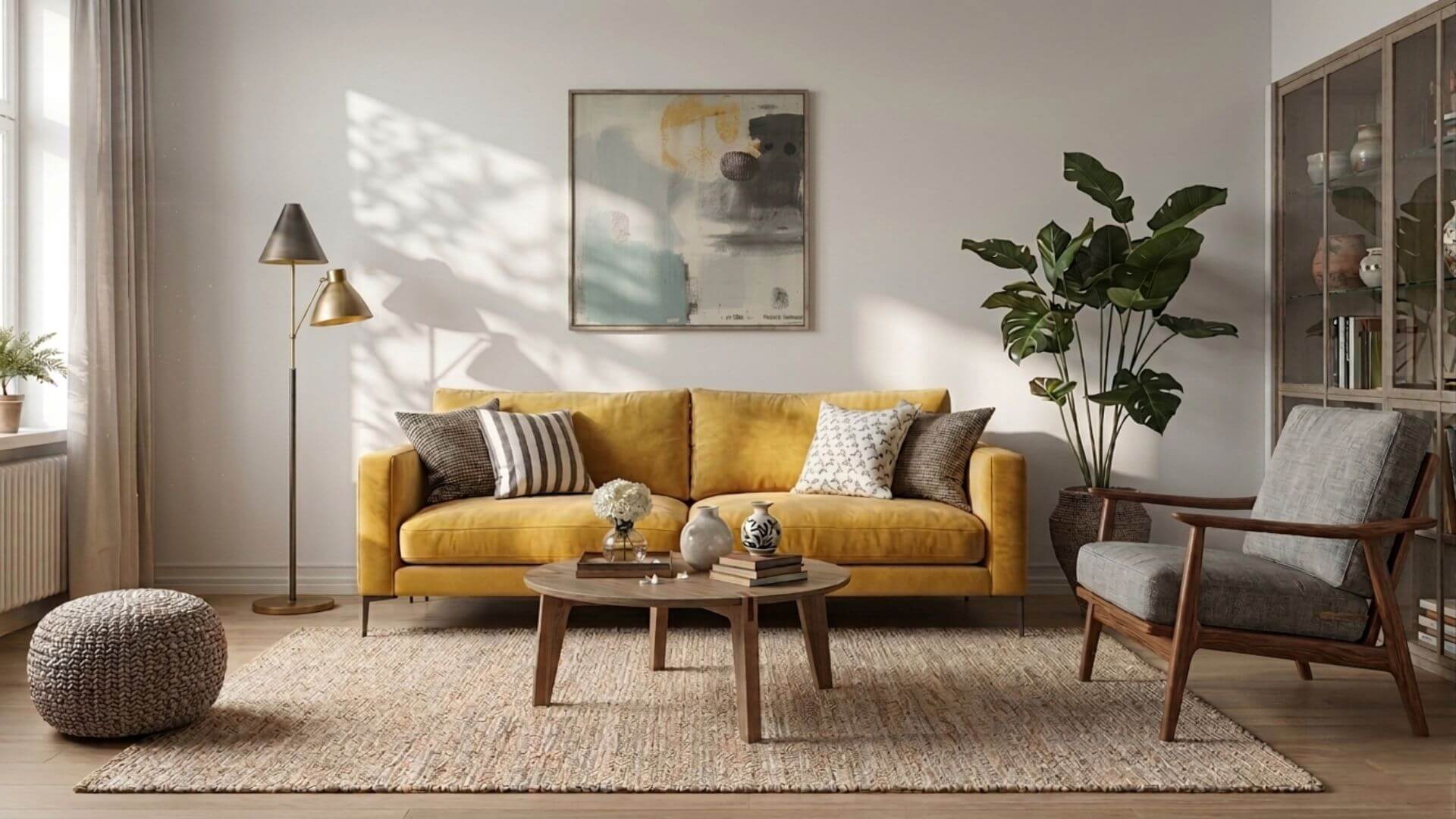
One of the simplest ways to create harmonious interior color combinations is to pair a neutral base with one bold accent color.
In this living room, soft gray and warm neutral tones provide a calm foundation, while a yellow sofa becomes the focal point. Natural materials and subtle textures soften the contrast, creating a space that feels both lively and balanced.
Why this combination works
Neutral colors allow a statement piece to stand out without overwhelming the room. By limiting stronger colors to one main accent, the overall design remains cohesive and timeless.
How to bring this look into your home
-
Start with neutral walls, rugs, and larger furniture.
-
Choose one accent color for a sofa, armchair, or artwork.
-
Use natural textures and softer supporting tones to maintain balance.
The key: Let one accent color make a statement while neutrals bring the room together.
Muted and Earthy Tones – Natural Harmony
Warm beige, natural wood and earthy tones in a living room.
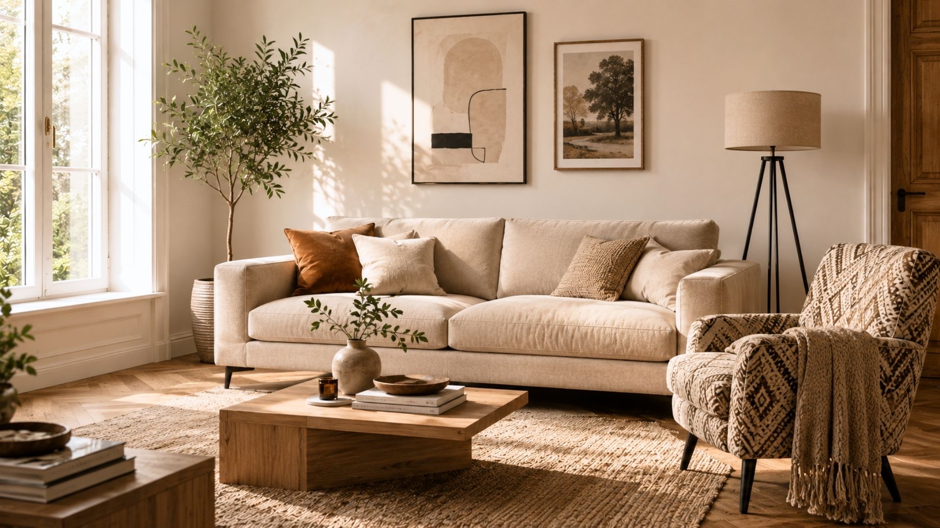
Muted and earthy color combinations bring natural warmth and understated elegance to a home. Shades of terracotta, sand, warm beige, and soft brown work beautifully together, creating a cohesive palette without strong contrasts.
Why earthy tones work
Their softened, muted character creates a gentle visual flow, while natural materials such as linen, wood, wool, and woven textures add depth and warmth.
How to use earthy colors at home
-
Living rooms: Combine warm beige upholstery with natural wood and terracotta accents.
-
Bedrooms: Layer sand, cream, and soft brown textiles for a restful atmosphere.
-
Dining rooms: Pair earthy neutrals with wooden furniture and warm lighting.
These versatile shades also transition beautifully between seasons, from lighter spring palettes to richer autumn tones.
For more inspiration, explore our natural color sofas and discover how earthy shades can create a harmonious living room.
Analogous Colors – A Soft, Flowing Palette

Analogous color combinations bring harmony to interiors by using shades that sit next to each other on the color wheel. Instead of strong contrasts, they create gentle transitions and a cohesive, calming atmosphere.
In this living room, deep blue, teal, and soft green flow naturally together. A blue sofa provides the foundation, while teal textiles and artwork add depth. Soft green accents complete the palette, creating a layered look without overwhelming the space.
Why this combination works
Blue, teal, and green share similar undertones, allowing them to blend smoothly. Natural wood, muted ochre, or soft gold accents introduce just enough warmth to keep the cool palette inviting.
How to recreate this look
-
Start with a dominant shade, such as deep blue.
-
Layer neighboring colors: blue → teal → soft green.
-
Vary the depth of each shade through textiles, artwork, and accessories.
-
Add natural wood or subtle warm accents for balance.
This approach works beautifully in living rooms, bedrooms, and quiet reading spaces where you want color without visual clutter.
Warm Analog Palette – Energy Without Chaos

Warm analogous color combinations bring richness and comfort to interiors without overwhelming the space. By layering related shades of terracotta, burnt orange, and soft ochre, you can create a welcoming palette that feels cohesive and full of character.
In this living room, terracotta provides the main color, while burnt orange and ochre add subtle variation. Warm beige, natural wood, and soft white keep the overall look light and balanced.
Why this palette works
The key is balancing color intensity with lighter surfaces. Soft neutral walls, natural textures, and varying shades of the same warm color family prevent the room from feeling too saturated.
How to recreate this look
-
Choose terracotta as the dominant color for a sofa, wall, or statement piece.
-
Layer burnt orange and soft ochre through cushions, artwork, or textiles.
-
Balance deeper tones with warm beige, soft white, and natural wood.
-
Use lighter backgrounds to maintain an open, inviting atmosphere.
Warm analogous palettes are particularly beautiful in living rooms, dining areas, and kitchens where warmth and comfort are essential.
How to Combine Colors in Interior Design

Creating harmonious interior color combinations starts with understanding the role each shade plays in a room. A simple approach is to choose one main color, support it with neutrals, and introduce a smaller accent for contrast.
In this living room, a deep green sofa anchors the design. Soft beige, light gray, and natural wood balance its richness, while muted ochre accents add warmth and personality.
A simple three-step approach
-
Choose a main color: Start with a sofa, feature wall, or another large element that defines the room.
-
Build a neutral foundation: Use beige, soft gray, cream, or natural wood to create balance.
-
Add a subtle accent: Introduce a complementary warm shade through cushions, artwork, or decorative details.
Why color proportions matter
Even beautiful colors can feel overwhelming when used in equal amounts. Let neutral and softer tones occupy most of the space, while stronger colors create smaller focal points.
If a room feels unbalanced, try reducing the strongest shade, softening its intensity, or introducing more neutral surfaces before making major changes.
The key: A harmonious color palette depends as much on proportion as it does on the colors themselves.
From Bland to Bold – How a Little Color Changes Everything
A neutral living room can feel elegant and peaceful — but sometimes, it needs a little personality. The good news? You don’t have to replace your furniture or repaint the walls to make a dramatic difference.
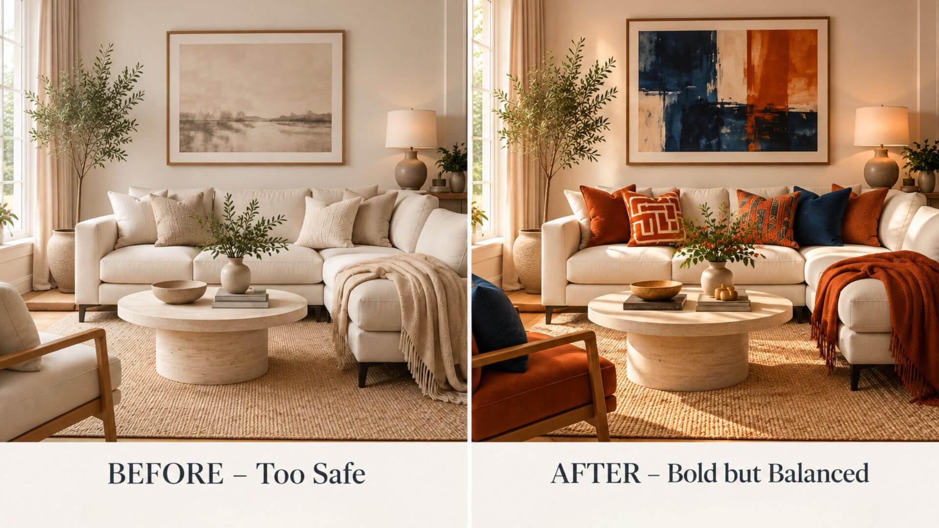 Before – Too Safe
Soft beige, cream, and ivory create a beautiful foundation, but without enough variation, the room can feel a little flat.
After – Bold but Balanced
The same living room comes alive with burnt orange, terracotta, and deep navy accents. Colorful cushions, expressive artwork, and a warm throw add depth and character while the neutral foundation keeps everything balanced.
Try this in your own home:
-
Keep your neutral sofa and larger furniture.
-
Introduce two complementary accent colors through textiles and artwork.
-
Repeat each accent shade in small details to connect the room.
The secret: You don’t always need more color — just a few thoughtfully placed accents that make the entire room feel different.
When Colors Clash – How to Fix an Unbalanced Room
Not every interior color combination feels harmonious, even when the individual colors are beautiful. Too many strong shades can compete for attention, making a room feel visually overwhelming.
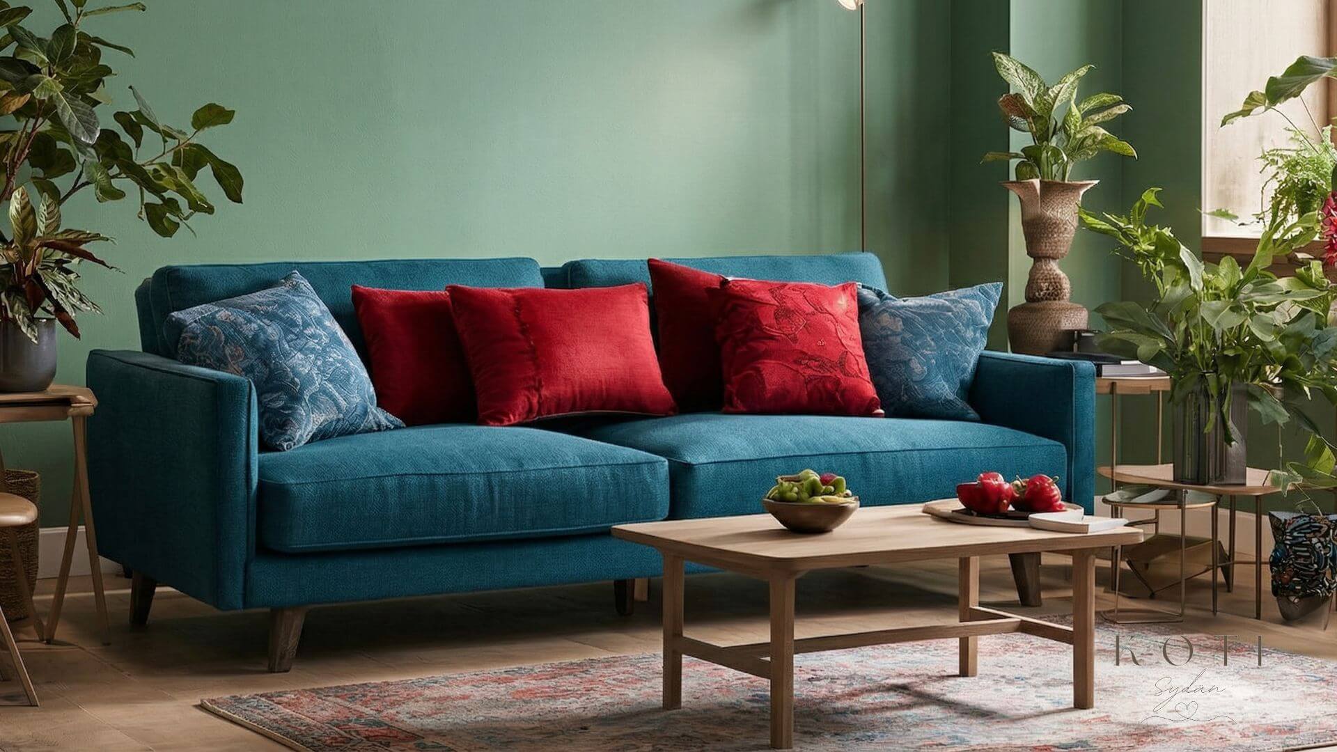
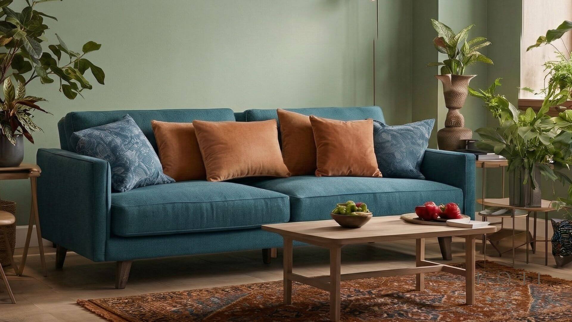 Softer harmony: teal and warm earthy tones create a more balanced palette.
What makes the difference?
In the first room, a deep blue sofa, bold green wall, and bright red accents compete for attention. Each color is striking, but together they create an intense, high-contrast palette.
In the second version, the colors are softened rather than completely replaced. Muted green and warm terracotta or brown accents create a gentler transition, while the room retains its character.
How to fix an unbalanced color scheme
-
Soften strong shades: Choose muted versions of highly saturated colors.
-
Reduce competing accents: Let one bold color take the lead.
-
Introduce neutrals: Beige, cream, or soft gray can create visual breathing room.
-
Add natural materials: Wood, linen, and wool help connect contrasting tones.
The goal isn’t to remove personality from a room, but to create a more cohesive and comfortable color palette.
The key: Small adjustments in color intensity and proportion can transform how an entire room feels.