
It’s not just the colors. It’s the proportions.
Have you ever saved a beautiful color combination, tried to imagine it in your living room — and realized that somehow it just didn’t feel right?
Maybe the colors looked sophisticated in an outfit. Perfect on a mood board. Effortless in an inspiration photo.
But once those same colors are translated into a sofa, rug, walls and furniture, the result can suddenly feel too dark, too busy or simply off.
The colors themselves may not be the problem.
The problem may be how much of each color you are using — and how much visual weight each one carries in the room.
A tomato-red pillow and a tomato-red sofa technically introduce the same color. Their effect on a room, however, is completely different.
The same is true of furniture. A dark oversized sectional has far more visual weight than a slim walnut side table, even if both belong to the same color family.
That is why creating a beautiful interior palette is about more than choosing colors that look good together.
It is about balancing color, proportion, visual weight, shape and texture.
If you’re still deciding which shades to pair together, start with our guide to Interior color combinations that create a harmonious home. Here are four very different living room palettes that show how it works.
If you’re building your room around a neutral foundation, explore our guide to the Best natural color sofas for more inspiration.
Here are four very different living room palettes that show how it works.
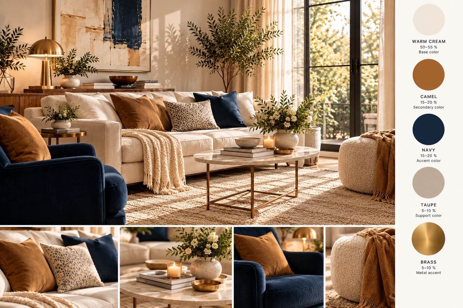 1. Navy + Camel + Warm Cream
Navy and camel are naturally sophisticated together.
But in a living room, using both colors too heavily can quickly make the space feel darker and more traditional than intended.
The easiest way to modernize the combination is to give both colors plenty of breathing room.
Try this balance
Warm cream: 50–55%
Navy: 20–25%
Camel: 15–20%
Wood, brass and natural elements: 5–10%
Let warm cream do most of the work.
Use it across walls, a large rug, curtains or other expansive surfaces. Then allow navy to create structure through one important piece rather than repeating it everywhere.
Camel brings warmth and prevents the blue from feeling too cool.
It might appear in leather, an accent chair, a throw or a few carefully chosen accessories.
Why this room works
Navy has significant visual weight.
A large navy sofa, dark rug and multiple navy accessories could make the same palette feel much heavier. One substantial navy element surrounded by lighter surfaces feels intentional instead.
Furniture shape matters here too.
A dark chair or sofa with visible legs feels lighter than a low, bulky piece sitting directly on the floor. An airy coffee table creates more breathing room than another solid piece of furniture.
The idea to remember:
Let a deep color anchor the room without allowing it to fill the room.
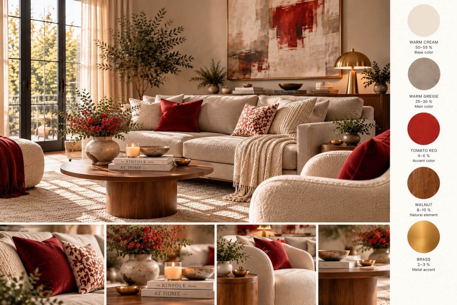 2. Warm Cream + Greige + Tomato Red
Tomato red might not be the first color you would think of for a sophisticated neutral living room.
That is exactly what makes it interesting.
Against warm cream and greige, a small amount of tomato red can make an otherwise quiet room feel fresh, confident and current.
The important words are a small amount.
Try this balance
Warm cream: 50–55%
Warm greige: 25–30%
Walnut: 8–10%
Tomato red: 4–6%
Brass: 2–3%
A warm greige sofa creates a soft focal point without becoming too pale or too dark.
Cream can cover the larger surrounding surfaces, while walnut introduces natural warmth.
Then comes the red.
One cushion. A small detail in a piece of art. Flowers or a ceramic object.
You do not need much.
Why this room works
Bold colors have more visual power than their physical size suggests.
A red pillow may occupy only a tiny percentage of the room, but your eye will probably notice it before a much larger cream rug.
This is the difference between physical proportion and visual proportion.
It is also why adding more red would not necessarily make this palette better. At some point, the accent would stop being an accent and begin competing with the room.
Walnut plays another important role. It adds depth without introducing a large block of chocolate brown that could make the palette unnecessarily heavy.
The idea to remember:
The stronger the color, the less of it you may need.
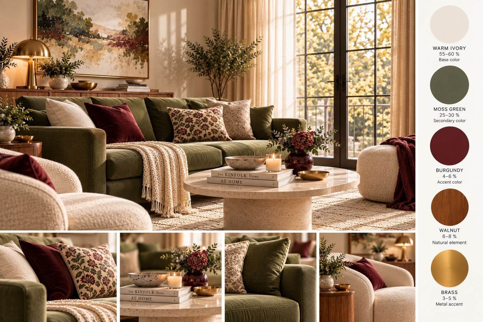 3. Warm Ivory + Moss Green + Burgundy
Moss green and burgundy can be beautiful together.
They can also become heavy surprisingly quickly.
Both colors have personality, depth and visual presence. Give them equal importance across large pieces of furniture and the room can begin to feel dense.
The solution is hierarchy.
Try this balance
Warm ivory: 55–60%
Muted moss green: 25–30%
Burgundy: 4–6%
Walnut: 6–8%
Brass: 3–5%
Warm ivory becomes the quiet background.
A muted moss-green sofa can then take on the role of the main color statement.
Burgundy is treated differently.
Instead of another large upholstered piece, use it in a velvet pillow, flowers, a vase or a subtle detail within artwork.
Walnut and aged brass help connect the warm and earthy undertones.
Why this room works
The palette has two characterful colors, but they are not competing for the same job.
Green is the secondary color.
Burgundy is the accent.
Ivory gives both of them space.
Texture also becomes important with deeper colors. Linen, boucle, velvet, stone and natural wood soften the transitions between colors and keep the room from feeling overly graphic.
The idea to remember:
When two strong colors work beautifully together, you still do not have to use them equally.
Give one the larger role and let the other become the finishing touch.
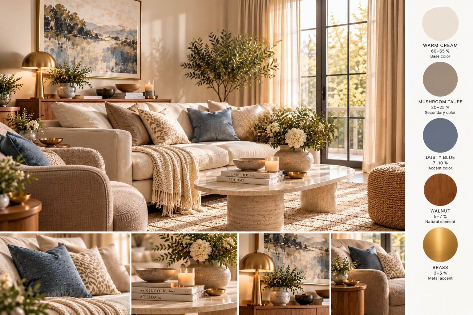 4. Warm Cream + Mushroom Taupe + Dusty Blue
Not every beautiful palette needs a bold accent.
Sometimes the most sophisticated rooms are built from colors that almost whisper.
Warm cream, mushroom taupe and dusty blue create a softer kind of contrast — one based on temperature, texture and subtle shifts in tone.
Try this balance
Warm cream: 60–65%
Mushroom taupe: 20–25%
Dusty blue: 7–10%
Walnut and aged brass: 5–8%
The blue matters here.
Rather than a sugary pastel or clear baby blue, look for a dusty blue with a little gray in it.
That muted quality allows it to sit comfortably alongside warm neutrals.
Cream keeps the room luminous. Mushroom taupe creates depth. Walnut and aged brass prevent the softer colors from becoming flat.
Why this room works
Dusty blue does not demand attention in the same way tomato red does.
That means you can usually use a little more of it.
The interest in a quiet palette can then come from materials and shapes rather than additional colors.
Think boucle against smooth wood. Linen against stone. A curved chair beside a clean-lined table. A softly aged metal lamp against a matte wall.
The idea to remember:
A quiet room does not necessarily need another color. Sometimes it simply needs another texture.
So, What Is the Right Color Ratio for a Living Room?
You may have heard decorating rules such as the classic 60-30-10 color formula.
It is a useful starting point — but it should not be treated as a mathematical requirement.
A practical way to think about it is:
55–65%: The quiet foundation
Walls, rugs, curtains and other large surfaces.
20–30%: The supporting color
A sofa, chairs, cabinetry or another significant element.
5–10%: The accent
Pillows, artwork, throws, ceramics, flowers and smaller details.
The remaining visual space can come from natural materials such as wood, stone and metal.
But there is one important adjustment:
The stronger the color, the more carefully you should consider its visual weight.
Five percent tomato red does not behave like five percent mushroom taupe.
That is why the numbers are a guide — not the design itself.
Don’t Forget the Shape of the Furniture
Color is only one part of visual balance.
Imagine a room with a dark sofa, a large solid coffee table, an oversized ottoman and two substantial armchairs.
Even with a perfectly coordinated palette, the room may still feel heavy.
Now imagine the same colors with a sofa raised slightly on legs, a slimmer table, one sculptural chair and more visible floor between the pieces.
The palette has not changed.
The visual weight has.
When choosing furniture, consider not only its color but also:
-
how large and solid it appears
-
whether the legs are visible
-
how much floor remains visible around it
-
whether its silhouette is blocky or airy
-
how many other substantial pieces are nearby
If one piece is visually heavy, let something else be light.
If the sofa is colorful, the surrounding furniture can be quieter.
If the palette is extremely neutral, interesting curves and textures can create personality without adding more color.
Texture Can Do What Another Color Cannot
One of the easiest mistakes to make with a neutral room is to keep adding colors because the space feels unfinished.
Sometimes color is not what is missing.
Texture is.
A cream room can contain several layers without introducing another hue:
a wool rug, linen curtains, boucle upholstery, veined stone, walnut wood and aged brass.
The colors remain restrained, but the room gains depth.
This becomes especially useful when working with a strong accent such as tomato red or burgundy. Instead of adding three more colors to make the room interesting, let the materials create the variation.
Before You Add Another Color, Ask These Three Questions
When a room does not feel balanced, look at the existing palette before buying something new.
1. Is one strong color taking up too much visual space?
The solution may be removing or reducing it rather than adding another color.
2. Are two strong colors competing for attention?
Choose which one should lead and which one should support.
3. Is the room actually missing color — or is it missing texture, shape or contrast?
A different material or a lighter piece of furniture may solve the problem more effectively than another accent color.
The Real Secret to a Beautiful Color Palette
Choosing colors is the fun part.
Knowing when to stop is often what makes the room feel sophisticated.
A successful palette usually has a clear hierarchy:
One color creates the background.
One gives the room character.
A smaller accent creates energy or contrast.
Natural materials connect the layers.
And the shapes of the furniture determine whether the finished room feels light, balanced and inviting — or visually crowded.
So the next time you find a beautiful color combination in an outfit, a mood board or an inspiration image, do not ask only:
Would these colors look good in my living room?
Ask:
How much of each color does my room actually need?
Because when a beautiful combination does not seem to work in a space, the colors themselves may not be wrong.
It’s not just the colors. It’s the proportions.